
Populous Brand Refresh
After five years of the previous brand guide, Populous needed an update along with its marketing materials. It was outdated and not in tune with the current design landscape.
The creative director and team came up with a new brand guide with a more modern typeface and shade of Populous Blue. It’s inspired by and reflective of Suisse design and current trends. This refresh cements Populous’ place in the space by showing clean, innovative design not only in their architecture, but by how they present themselves.
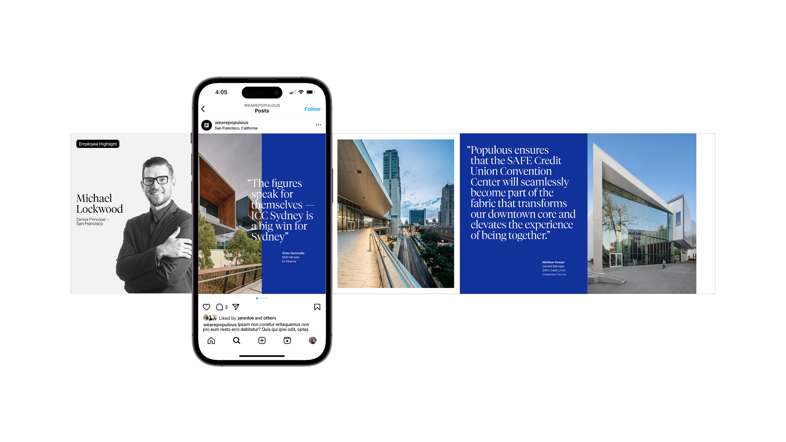
My role was senior graphic designer tasked with leading design of business proposals and everything they contain, social media, and business cards. I worked with the creative director (Americas), marketing design manager, and fellow designers on my team.
Expertise
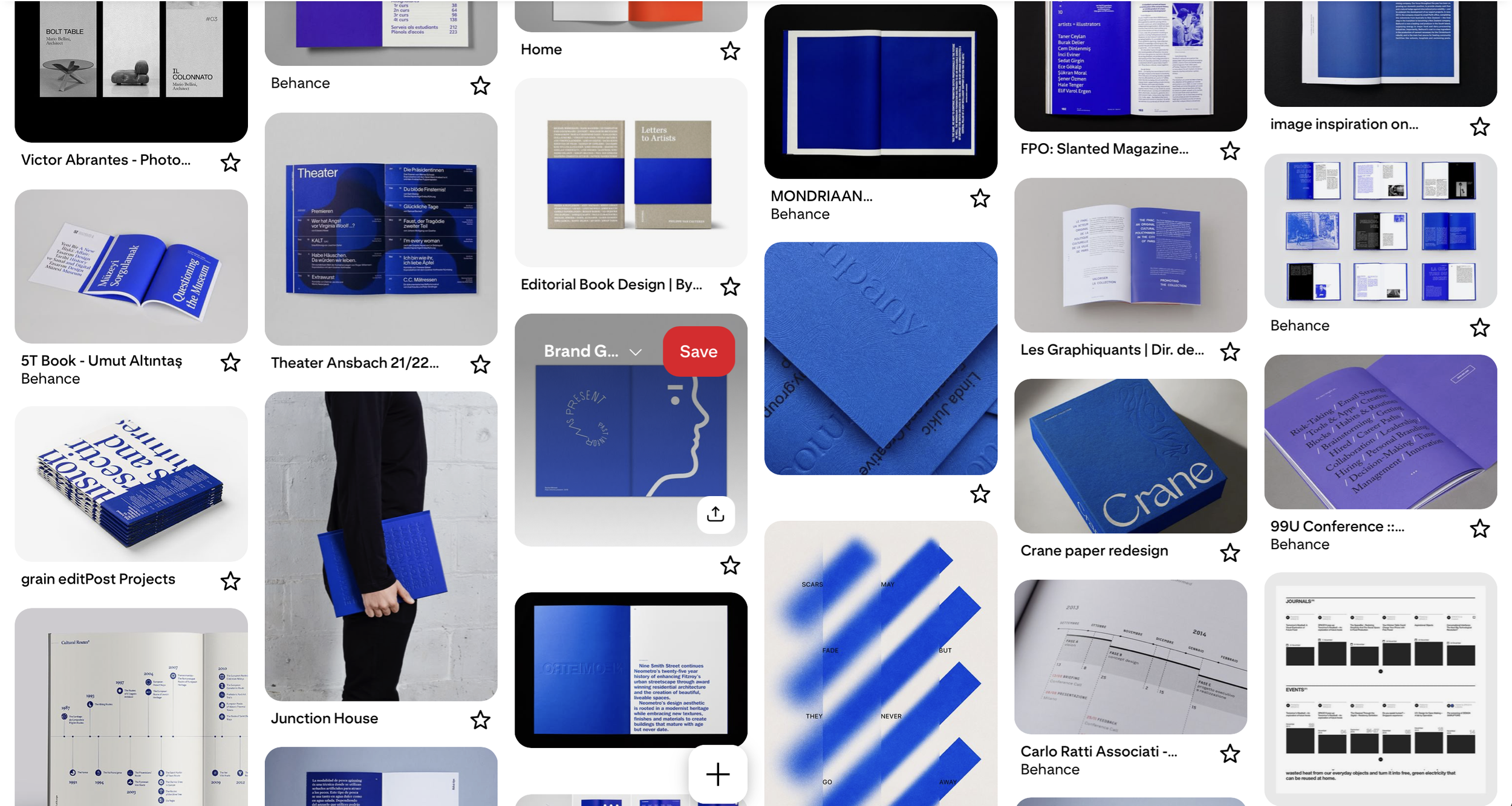
Inspiration

Business cards

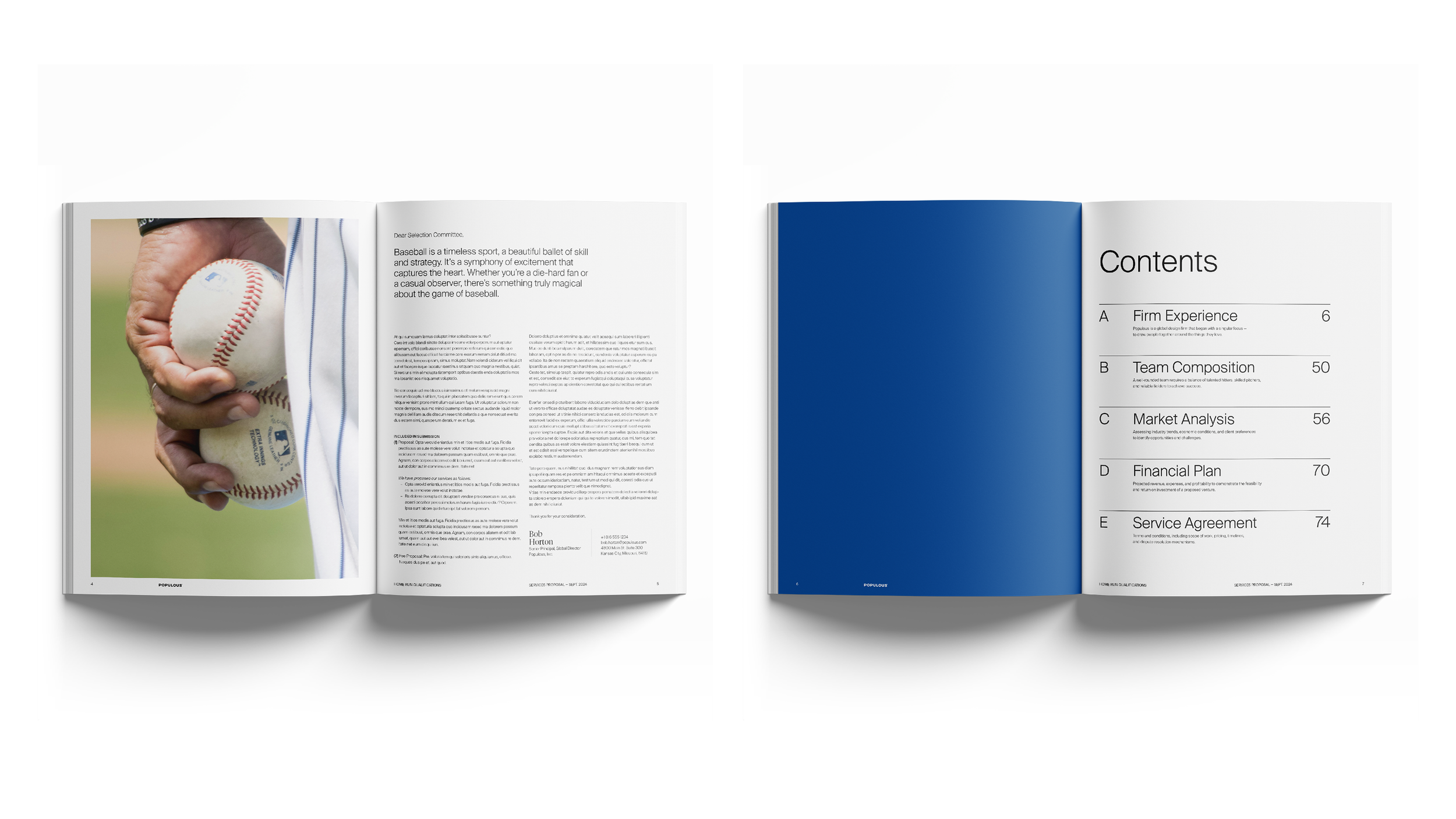
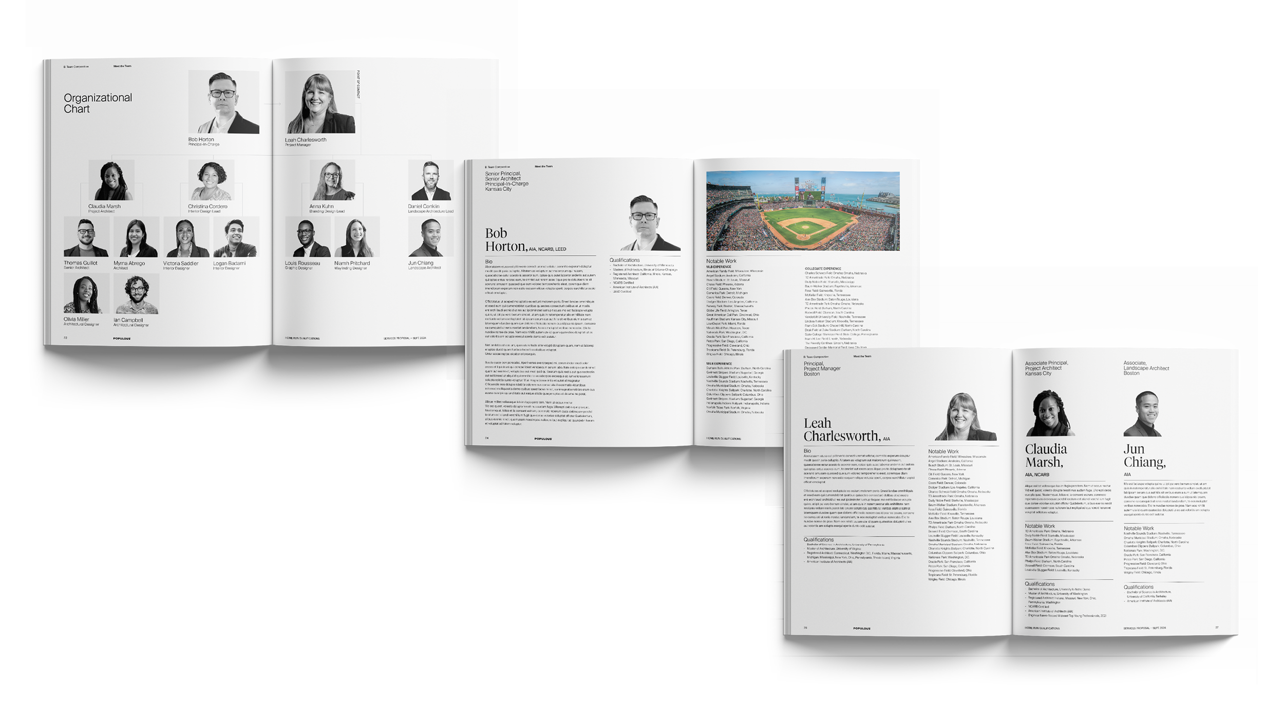
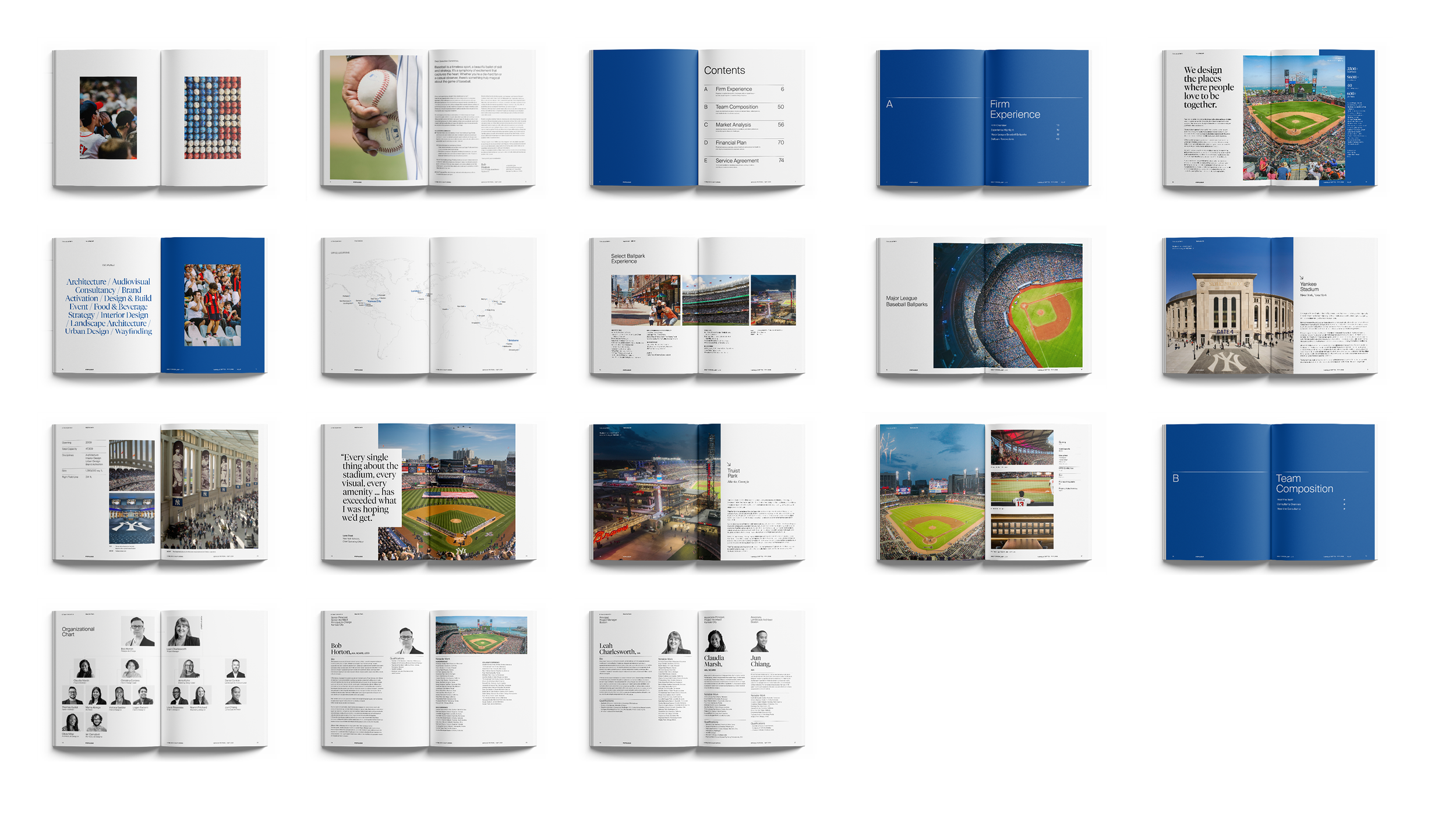
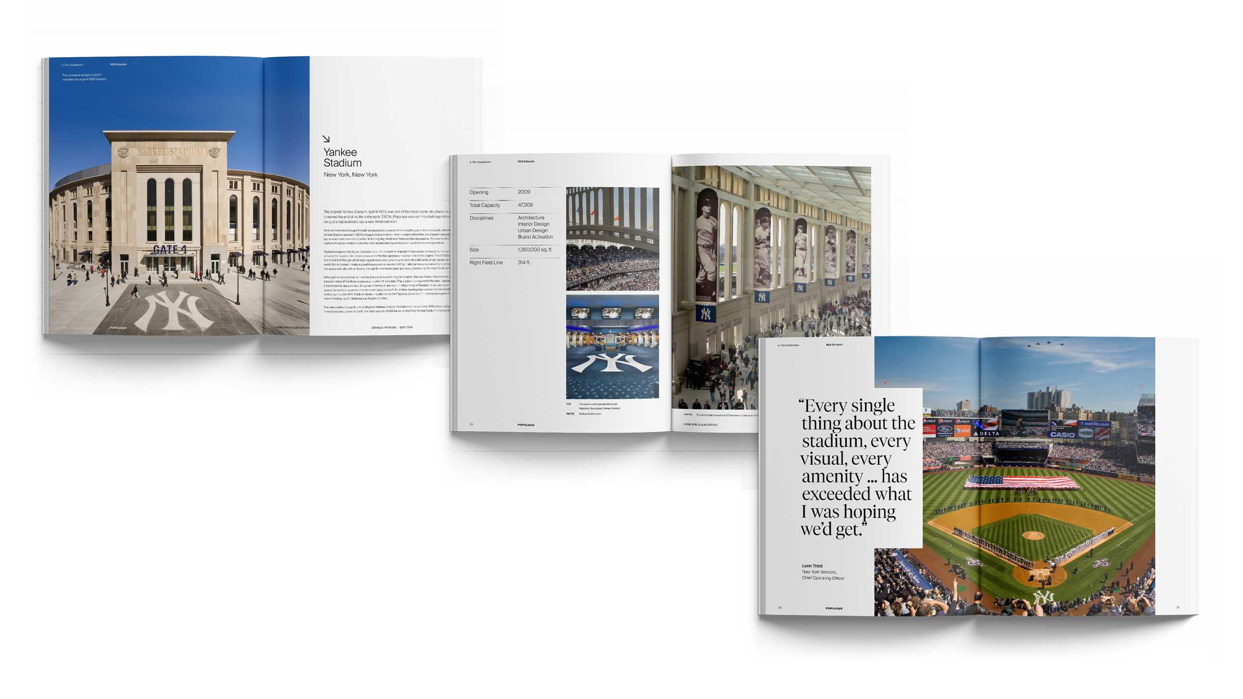
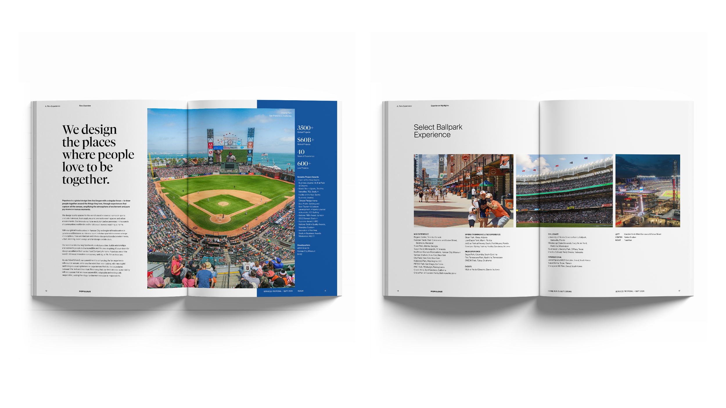
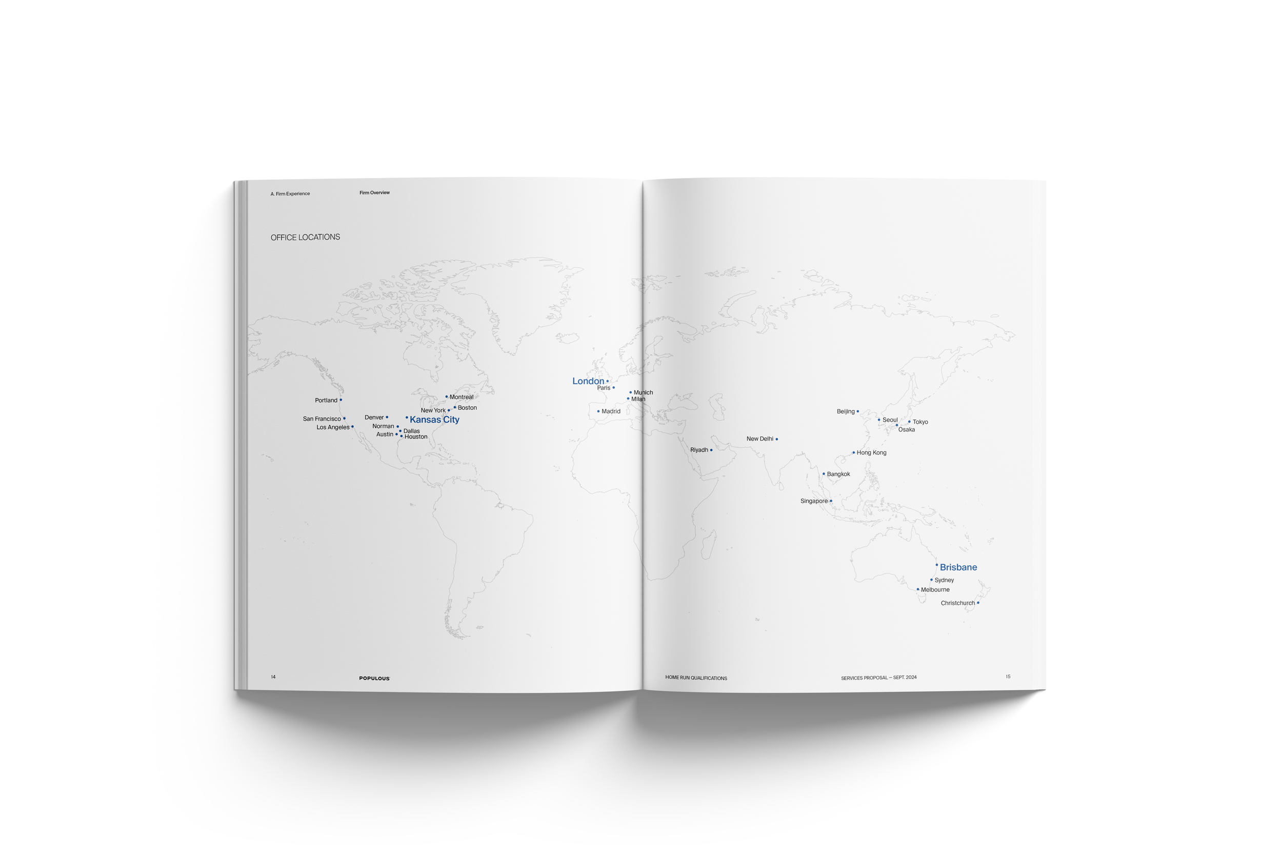
Sample Qualifications Package




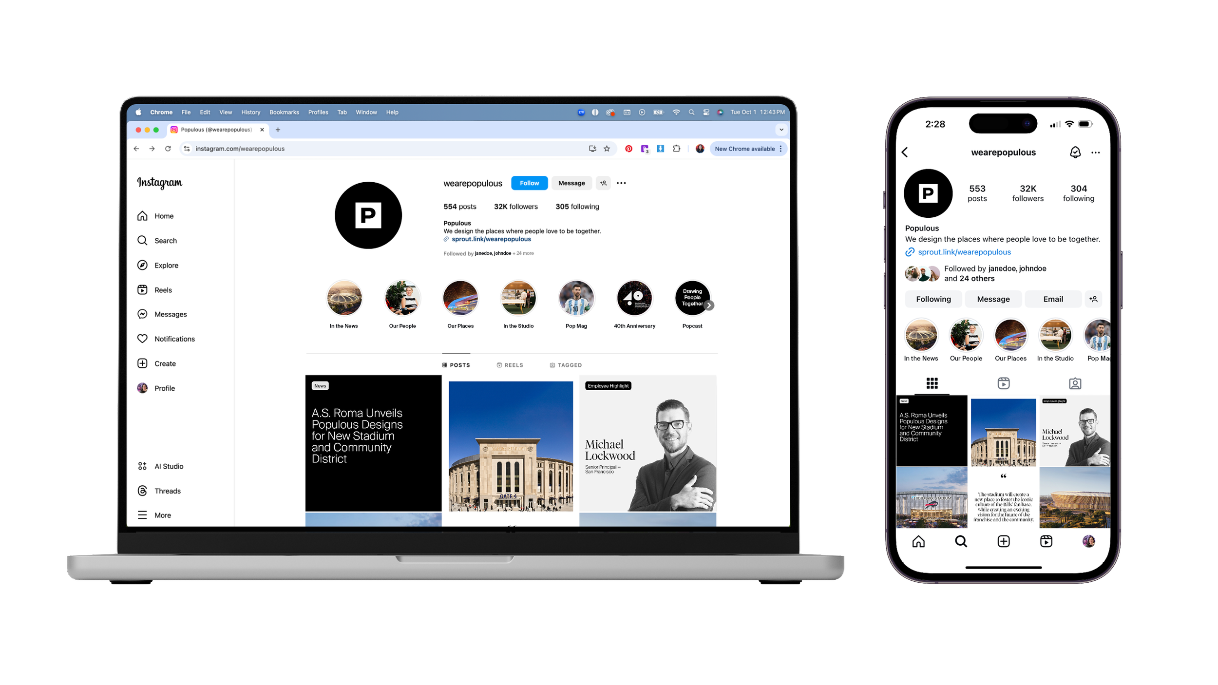
Social media updates



Project one-pager
